Showing posts with label OUCS106. Show all posts

Monday, 28 March 2011

End of Module Submission

Tuesday 29th March 2011.


Essay and Bibliography - Resubmission

'Advertising doesn't sell things; all advertising does is change the way people think or feel.' (Jeremy Bullmore). Evaluate this statement with reference to selected theoretical theories.


          Advertising is a common form of communication, set out with intentions to persuade a selected target audience to generate a sense of need for what is being advertised: whether it’s a brand, service or product. Jeremy Bullmore raises a thought-provoking point with his statement expressing his opinion on how he considers advertising to work:
…”Advertising doesn’t sell things; all advertising does is change the way people think or feel”…
          More often than not, advertising relies on endorsing its audience with the impression that along with this product if you purchase it, your life will automatically be more like this ‘ideal’ lifestyle, or you will fit in more within the genre of people that is represented throughout its advertising campaign – thus leaving the impression that the main focus of an advertisement is to focus on promoting the lifestyle, rather than the actual product. They do this by making them envy what it possesses, leaving them with the feeling that what they already have is inadequate in comparison – therefore leaving them wanting to purchase it.
…”Advertising’s central function is to create desire that previously did not exist. Thus advertising arouses our interests and emotions in favor of goods and more goods…it is thus the advertiser’s task to try to persuade rather than inform.”… (Dyer, 1982, p6)
          The advertiser sets out with intentions of creating a branding for a product that usually involves the repetition of an image, message or product name, which should in time create an idea of related qualities to the brand in the mind of the audience. An interesting example of this is the message that Dove allocates to their soap for women with dry skin, promising to ‘leave your skin soft and smooth – without the dry feeling caused by soap’ (Ogilvy, 1995, p12). This promise was first allocated to the product over 25 years ago by copywriter David Ogilvy, and is still used within their advertising campaigns today – along with other promises such as the ability to firm skin, quoting in one of their more recent ads ‘Let’s face it. Firming the thighs of a size 8 supermodel is no challenge’ (Williams, 2010, p47).
          One thing that is vital when advertising agencies begin any new projects is to research: to fully understand what it is they are promoting. Most times the client would provide a sufficient amount of research relevant to what they are wanting, but then it is down to the advertisers to fill in the gaps: to look at the more meticulous details about the product to generate ‘a clear understanding of the brands current position’ such as what the consumers already ‘actually think about the product, as opposed to what the client believes that they think’ (Ogilvy, 1995, p9). This way it ensures the campaign can be as effective as possible.
…”Now comes research among consumers. Find out how they think about your kind of product, what language they use when they discuss the subject, what attributes are important to them, and what promise would be likely to make them buy your brand.”… (Ogilvy, 1995, p12)
          As well as the research aspect, the message that the campaign is going to have is decided upon within the early stages to give it more of a directed focus: therefore proving that the main intention within the campaign is to create envy towards it (Wikipedia, 2011, online). This entails them to consider factors such as the target audience it is intended to appeal to, and the background of them and so on.
What’s interesting is the people’s choice of what brand they ‘choose’ to consume from a variety of different ones, all fundamentally for the same product.
…”Take Whiskey. Why do some people choose Jack Daniels, while others choose Grand Dad or Taylor? Have they tried all three and compared the taste? Don’t make me laugh. The reality is that these three brands have different images which appeal to different kinds of people. It isn’t the Whiskey they choose, it’s the image. The brand image is 90 per cent of what the distiller has to sell.”… (Ogilvy, 1995, p15)
          Looking at the advertising for two different brands of lager: such as Carling and Budweiser, it is apparent that a similar thing happens with their advertising strategies. They both are proud of the countries that they originate from and this reflects well within their ads, and each have a distinct audience they want to target.
          Carling is a British lager that derived from the mid 1900’s after a team of British Brewers came together and discovered a way of involving the flavor of ale with the refreshment of continental lager. It is made from ‘only the best British barley’ (Molson Coors Brewing Company Ltd, 2011, online), and is proud to have this as the main aspect of one of their recent advertising campaigns.
          Budweiser is an American lager, ‘perfected in 1876’ by Adolphus Busch. This exact recipe, brewing process and taste has remained the same for more than 133 years, and will be staying the same for a long time as they believe this is what has made the product so successful (Anheuser-Busch, 2010, online). The fact that the lager is American reflects clearly throughout their advertisements with it coming across to the audience that the brand is better and brighter than others, which is also a good representation of something American.
          After watching a recent television advert for these brands, the target audience that they are reaching towards is apparent, and quite distinct from each others. The Carling advert has a group of English friends in their twenties out together in the middle of no where, with one providing the Carling from the nearest source – this insists their target audience is adults who like to have a laugh, go out to have a good time and stick together. Where as the Budweiser advert is of a hectic stadium of people all having an exciting time together; which insists their target audience is the type of person who likes to be in the middle of the action and not miss out on something ‘amazing’.
          Throughout the whole thirty seconds of the Budweiser advert, apart from the general noise from the stadium, there is no voice at any point that says anything about the product. There is just the end where the logo appears on the screen and underneath it has the strapline ‘this is beer’ for the viewer to read. By doing this, as well as having thousands of people all together in a huge place suggests that the product is that successful and popular it can speak for itself with its quality and status. Having the stadium so busy and showing that everyone is having a good time suggests that by drinking Budweiser it brings all sorts of people together as though it has its own community or is in a league of its own. This is then endorsing the audience with the thought that they could also be involved in something as amazing as this – if they drink this lager, and creates desire and envy for wanting this sort of life, and to be there in the middle of what is happening amongst the rest of the targeted audience. The imagery shows the crowd all in sync holding coloured boards above their heads each in the right order so that when it is seen from above, it shows a Budweiser bottle being opened and poured into a glass, and after being drank. Immediately thereafter the whole crowd at once throw their heads back with huge grins on their faces doing somewhat over enthusiastic ‘ahhh’ sounds that people make after finishing a very satisfying, refreshing drink they enjoyed.
          Unlike this, the Carling advert is more relaxed by having just a few close friends in the middle of a dessert with the weather conditions being very hot, and one of them goes out of his way to find them a lager. He then returns to find he has forgotten one and insists on going back for another, suggesting that Carling is worth all the time and effort, as well as connoting the fact that people who drink it stick together and would do anything for each other, no matter what the situation is. The whole scene could be adapted as a metaphor of a situation that could happen anywhere in the world, and can always be made better being with your closest friends drinking Carling. The end of the advert has the sentence ‘You know who your mates are’, followed by the logo and strapline saying ‘Tastes great, every sip of the way’. Even by this it shows that Carling are intending on aiming their advertising towards someone who values their friendships, and by having Carling as a common interest amongst them ensures these friendships will stay strong and stick together. What Carling is promising to its target audience and generating envy towards in order to promote their brand is solid friendships with those that matter, as well as the enjoyment of a well-needed refreshing drink anywhere in the world.
          In all, it is believed that advertisings main purpose is to influence its targeted audience into feeling the desire to purchase the product being advertised, by making them envy the status and lifestyle it embodies. It is agreeable with what Bullmore articulates; that fundamentally all it does is ‘changes the way people think or feel’, but in order for someone to purposely go out of their way to buy a particular product does usually originate from feelings in the first place, but without this raises the question as to whether advertising would work at all without these feeling involved.


Bibliography

Anheuser-Busch, 2010. Budweiser. [online] Available at:< http://www.budweiser.com/public/agecheck.aspx?ReturnUrl=%2fen%2fdefault.aspx&AspxAutoDetectCookieSupport=1#/en/index> [Accessed 15th January 2011].

Burtenshaw, K. Mahon, N and Barfoot, C, 2006. The Fundamentals of Creative Advertising. Case Postale: AVA Publishing SA.

Dooley, R, 2009. Emotional Ads Work Best. Neuromarketing. [blog] 27th July. Available at:< http://www.neurosciencemarketing.com/blog/articles/emotional-ads-work-best.htm> [Accessed 15th January 2011].

Dyer, G, 1986. Advertising as Communication. London: Methuen & Co. Ltd.

Hanson, D J, 2009. Alcohol Advertising Facts and Information. [online] Available at:< http://www2.potsdam.edu/hansondj/Controversies/1106153502.html> [Accessed 17th January 2011].

McNamara, S L, 2010. Persuasive Advertising Theories. [online] Available at:< http://www.adcracker.com/theory/Persuasive_Advertising_Theories.htm> [Accessed 14th January 2011].

Mfirth199, 2010. New Carling “Round” Ad. [video online] Available at:< http://www.youtube.com/watch?v=0gyD9zR8U3A> [Accessed 15th January 2011].

Molson Coors Brewing Company Ltd, 2011. Carling. [online] Available at: http://www.carling.com/index.html [Accessed 15th January 2011].

Ogilvy, D, 1995. Ogilvy on Advertising. London: Prion Books.

Rakesh048, 2008. Amazing Budweiser Ad. [video online] Available at: [Accessed 15th January 2011].

Unilever, 2011. Dove. [online] Available at :< http://www.dove.co.uk/> [Accessed 17th January 2011].

Wikipedia, 2011. Advertising. [online] Available at: [Accessed 14th January 2011].

Williams, E, 2010. This is Advertising. London: Laurence King Publishing Ltd.

Saturday, 5 March 2011

Essay Question

From the list of essay questions available, the one I have chosen to cover is:

"'Advertising doesn't sell things; all advertising does is change the way people think or feel.' (Jeremy Bullmore). Evaluate this statement with reference to selected theoretical theories.

The advertisements I looked at for the essay to support my points were:


Tuesday, 15 February 2011

Deconstrustion Task

Using given text, write 500 words on what it has to say about deconstruction.


A main block of text to a typographer is usually referred to as the ‘body’: defined as an ongoing sequence of words, it has more integrity and wholeness than any surrounding elements, including headlines and captions. It’s a sturdy object that flows from page to page and is treated consistently, with long texts broken down into chunks offering shortcuts and alternate routes such as indents and hyperlinks.
            Before the mass production of movable type, handwritten texts usually consisted with errors, each with their own glitches and gaps where copies were copied from copies, making them seem more personal. They had their own interpretation from the one who wrote it, which meant that the reader was left questioning what the text was saying. Printing text introduced a new way to ensure the faithfulness to the author’s handwritten original, making the role of the ‘proofreader’ to correct any errors within it right from the original copy to the final production, without misrepresenting the authors work.
            Contemporary typographers produce bodies of text for various contexts, each with their own limitations and opportunities, ensuring the help for the readers to navigate the flow of the content. Typographic pages emphasize the completeness and closure of a work, and follow a grid of known coordinates. They ensure that the reader isn’t aware that they are reading, but at the same time they certify that the content is read in a certain order that is intended, making the typographer invisible to them. Even so, their role is just as important as the spaces and punctuation, where French philosopher Jacques Derrida quotes they are ‘seen but not heard’.
            French critic Roland Barthes believes that the reader ‘performs’ the writing – ‘death of the author’, where the reader chooses to create meaning. Todays Graphic Designers embraced Barthes’ idea of the readable text using layers and interlocking grids to explore his theory breaking grids and rules, making how the text is used more important than what it actually means. By destroying structure, it makes the reader more aware of it: unpicking it, making it strange and question what is normal. It changes the way that the text is read and makes the readers’ role more active and thought provoking, revealing how the type affects meaning. Writing occupies space as well as time, and liberates readers from bonds of linearity; which is amongst typography’s most urgent tasks.


David Carson / End of Print Presentation Poster / 1996 / URL

David Carson's work is very representative of the deconstructionists style. The example I have included is good as it consists of just type, so it showcases how it has allowed Carson to completely destroy the structure. Even with the headline section at the top with the bolder text: it overlaps and doesn't read in the right order, so even though the immediate reactions are primarily drawn to this, it still makes the viewer think more about what they are reading. The rest of the body of text with all the relevant information has a strange, random layout, with no obvious beginning or an end, leaving the viewer to start reading anywhere and unpick the structure within it - making them question what is normal and become more active in finding out the relevant information they want to gain from it. The way that Carson has used multiple typefaces also adds to the effect of the deconstruction as it causes more immediate confusion that the viewer then has to untangle, and reveals more effectively how type affects the meaning. Definitely with this poster, the intention to absorb the information from it works a lot better than one that follows a typical grid and reads in a particular way as it is down to each individual to 'find' what they want to know - this ultimately achieves a better response from it as they are then more likely to actually remember it.

Deconstruction Seminar Notes


Tuesday, 8 February 2011

Avant Garde Task

In 300 words, discuss the concept of 'Avant Garde' in relation to two examples of Graphic Design (include pictures and references).


Avant Garde – sometimes known as ‘advance guard’ or vanguard, refers to people or work that is considered to be innovative or experimental with aims to shock, challenge and re-assess conventions. It pushes boundaries of what is usually accepted as ‘normal’, and artists which are involved consider themselves and what they do to be innovative and ahead of the majority. The concept of Avant Garde refers exclusively to marginalized artists whose work opposes the mainstream values and often has an abrasive social or political edge, as well as introduces and explores new forms or subject matters. It is said to have began in 1850’s with the Realism or Gustave Coubert, followed by the successive movements of modern art, making the term Avant Garde more or less synonymous with modern. Nowadays, the term has grown to be almost neutralized, leaving it meaningless to the point where it can be applied to anything.


Marcel Duchamp / 1917 / Fountain / URL

Marcel Duchamp is definitely one of the most memorable artists considered within Avant Garde, with works such as the ‘Mona Lisa’ and  ‘Fountain’ (pictured). He caused a huge riff within art around 1917 when he entered his ‘Fountain’ piece into an open exhibition under the name of R. Mutt, where anything was accepted; but this actually wasn’t and was mysteriously misplaced and not exhibited resulting with the original piece being lost. It totally went against what art was believed to be at this time, and Duchamp entered it to shift the focus of art from physical craft to intellectual interpretation. It was something people has not seen done before, and they refused for sometime to accept because they didn’t consider it to be ‘actual art’ due to the fact that he didn’t make it with his own hands – this later proved to be irrelevant.

Oliviero Toscani / United Colours of Benetton / URL

A more recent example of Avant Grade is the advertising campaigns from the label United Colours of Benetton. Not only do they promote themselves as a brand, but also tackle racism showcasing images of things the public would not necessarily expect to see. In just a few years, Benetton became a global force with their concept of encompassing the different races to the ideas of tolerance, peace and respect for diversity. As shown in the example, they have a black woman breast feeding a white baby, incorporating the 'shock' factor of Avant Garde. It is making the statement that all colours are united as one, and by using such strong imagery not just in this example but in all of their campaigns, definitely challenges peoples beliefs amongst racism, and forces them to re-asses it. The 'united' colours of their sweaters is considered to be a metaphor for the united skin tones from the youth of different countries for who the sweaters were designed for. 

'Defining the Avant-Garde' Seminar Notes


Tuesday, 1 February 2011

5 Examples of Post Modern Graphic Design

Here is my 5 examples of Post Modern Graphic Design.

Postmodernism has an attitude of questioning conventions, especially ones set out through Modernism. The only rule within it is that there are no rules, and celebrates what might otherwise be termed kitsch. It is a reaction to modern life and technology, and has no progressive meaning - designed to blow up and destroy itself in a way of expressing how the modern world is destroying itself. It is not about equality, but more personal and about difference, exposing the flaws from the structures of the past. Re using images and a rejection of technological determinism.

David Carson / Ray Gun No 15 Magazine Cover / URL

This magazine cover for Ray Gun by David Carson is a good example of Postmodernism because of the way that he has just completely stripped any structure to it. The text within it doesn't follow any form and overlaps, not really making any sense with only a few words actually left readable. The whole thing, when properly considered, is actually really simple, but with the way he has positioned the type and dark background image really builds it up.

Jamie Reid / 1977 / Sex Pistols Album Cover / URL

This Sex Pistols album cover by Jamie Reid is a strong example of Postmodernism with the way that none of the typefaces that he has used in it actually really go together, but when forced together with no specific order other than to give the title works really well. Just the fact that such a varied amount of typefaces have been used within one design completely goes against what many typographers believe to be 'right', as the more that is used, the less effective it works - but this example clearly proves otherwise.

Dan Friedman / Typografische Monatsblatter / 1971 / URL

The way that Friedman has used a montage style with the different typefaces scattered randomly over the top of the image of times square makes this example Postmodern, showing how he didn't follow any rules when putting it together and didn't try and follow any sort of grid within the image. It looks simple and reduced.

Kunst Kredit / Wolfgang Weingart / 1977 / URL

Both the type and images used within this poster had a Postmodern style, with an unstructured overall look. 

Katherine McCoy / Cranbrook graduate poster / 1989 / URL

Again, the type and image used within this poster has a very Postmodern style, and has avoided and form or grid or structure. Most of the body of text that is used within it also is illegal due to the fact of the photomontage underneath with the bases of function follows form.

Tuesday, 25 January 2011

Essay and Bibliography

Envy and Desire Within Advertising

            Advertising is a common form of communication, set out with intentions to persuade a selected audience to generate a sense of need for what is being advertised: whether it’s a brand, service or product. Jeremy Bullmore raises a thought-provoking point with his statement expressing his opinion on how he considers advertising to work:
       …”Advertising doesn’t sell things; all advertising does is change the
way people think or feel”…
More often than not, advertising relies on endorsing its audience with the impression that along with this product if you purchase it, your life will automatically be more like this ‘ideal’ lifestyle, or you will fit in more within the genre of people that is represented throughout its advertising campaign. They do this by making them envy what it possesses, leaving them with the feeling that what they already have is inadequate in comparison – therefore leaving them wanting to purchase it.
…”Advertising’s central function is to create desire that previously did not exist. Thus advertising arouses our interests and emotions in favor of goods and more goods…it is thus the advertiser’s task to try to persuade rather than inform.”… (Dyer, 1982, p6)
The advertiser sets out with intentions of creating a branding for a product that usually involves the repetition of an image, message or product name, which should in time create an idea of related qualities to the brand in the mind of the audience. An interesting example of this is the message that Dove allocates to their soap for women with dry skin, promising to ‘leave your skin soft and smooth – without the dry feeling caused by soap’. This promise was first allocated to the product well over 25 years ago by copywriter David Ogilvy, and is still used within their advertising campaigns today – along with other promises such as the ability to firm skin, quoting in one of their more recent ads ‘Let’s face it. Firming the thighs of a size 8 supermodel is no challenge’.
Something that is vital when advertising agencies begin any new projects is to research: to fully understand what it is they are promoting. Most times the client would provide a sufficient amount of research relevant to what they are wanting, but then it is down to the advertisers to fill in the gaps: to look at the more meticulous details about the product to generate ‘a clear understanding of the brands current position’ such as what the consumers already ‘actually think about the product, as opposed to what the client believes that they think’. This way it ensures the campaign can be as effective as possible.
…”Now comes research among consumers. Find out how they think about your kind of product, what language they use when they discuss the subject, what attributes are important to them, and what promise would be likely to make them buy your brand.”… (Ogilvy, 1995, p12)
As well as the research aspect, the message that the campaign is going to have is decided upon within the early stages to give it more of a directed focus: therefore proving that the main intention within the campaign is to create envy towards it. This entails them to consider factors such as the target audience it is intended to appeal to, and the background of them and so on.
            What’s interesting is the people’s choice of what brand they ‘choose’ to consume from a variety of different ones, all fundamentally for the same product.
…”Take Whiskey. Why do some people choose Jack Daniels, while others choose Grand Dad or Taylor? Have they tried all three and compared the taste? Don’t make me laugh. The reality is that these three brands have different images which appeal to different kinds of people. It isn’t the Whiskey they choose, it’s the image. The brand image is 90 per cent of what the distiller has to sell.”… (Ogilvy, 1995, p15)
            Looking at the advertising for two different brands of lager: such as Carling and Budweiser, it is apparent that a similar thing happens with their advertising strategies. They both are proud of the countries that they originate from and this reflects well within their ads, and each have a distinct audience they want to target.
            Carling is a British lager that derived from the mid 1900’s after a team of British Brewers came together and discovered a way of involving the flavor of ale with the refreshment of continental lager. It is made from ‘only the best British barley’, and is proud to have this as the main aspect of one of their recent advertising campaigns.
            Budweiser is an American lager, ‘perfected in 1876’ by Adolphus Busch. This exact recipe, brewing process and taste has remained the same for more than 133 years, and will be staying the same for a long time as they believe this is what has made the product so successful. The fact that the lager is American reflects clearly throughout their advertisements with it coming across to the audience that the brand is better and brighter than others, which is also a good representation of something American.
            After watching a recent television advert for these brands, the target audience that they are reaching towards is apparent. The Carling advert has a group of English friends in their twenties out together in the middle of no where, with one providing the Carling from the nearest source – this insists their target audience is adults who like to have a laugh and go out to have a good time and stick together. Where as the Budweiser advert is of a hectic stadium of people all having a good time together; which insists their target audience is the type of person who likes to be in the middle of the action and not miss out on something ‘amazing’.
            Throughout the whole 30 seconds of the Budweiser advert, apart from the general noise from the stadium, there is no voice at any point that says anything about the product. There is just the end where the logo appears on the screen and underneath it has the strapline ‘this is beer’. By doing this, as well as having thousands of people all together in a huge place suggests that the product is that successful and popular it can speak for itself with its quality and status. Having the stadium so busy and showing that everyone is having a good time suggests that by drinking Budweiser it brings all sorts of people together as though it has its own community or is in a league of its own. This will create desire and envy for wanting to be there in the middle of what is happening amongst the targeted audience. The imagery shows the crowd all in sync holding coloured boards above their heads each in the right order so that when it is seen from above, it shows a Budweiser bottle being opened and poured into a glass, and after being drank. Immediately thereafter the whole crowd at once throw their heads back with huge grins on their faces doing the ‘ahhh’ sound people make after finishing a refreshing drink they enjoyed.
            Unlike this, the Carling advert is more relaxed by having just a few close friends in the middle of a dessert with the weather conditions being very hot, and one of them goes out of his way to find them a lager. When he returns it turns out he has forgotten one and insists on going back to get another, suggesting that Carling is worth all the time and effort. As well as the fact that people who drink it stick together and would do anything for each other in whatever situation. The whole scene could come across as a metaphor of something that could happen anywhere in the world, and can always be made better with Carling. The end of the advert has the sentence ‘You know who your mates are’, followed by the logo and strapline saying ‘Tastes great, every sip of the way’. Even by this it shows that Carling are intending on aiming their advertising towards someone who values their friends more than anything, and it can make these friendships stronger. What Carling is promising to its target audience in order to persuade them to buy their brand is stronger friendships with those that matter, and would do anything for each other, as well as the enjoyment of a well-needed refreshing drink anywhere in the world.
            In all, I do believe that advertisings main purpose is to influence the targeted audience into feeling the desire to purchase the product being advertised, by making them envy the status and lifestyle it embodies. I agree with what Bullmore articulates; that fundamentally all it does is ‘changes the way people think or feel’, but without this raises the question as to whether advertising would work at all without these feeling involved.


Bibliography

Anheuser-Busch, 2010. Budweiser. [online] Available at:< http://www.budweiser.com/public/agecheck.aspx?ReturnUrl=%2fen%2fdefault.aspx&AspxAutoDetectCookieSupport=1#/en/index> [Accessed 15th January 2011].

Burtenshaw, K. Mahon, N and Barfoot, C, 2006. The Fundamentals of Creative Advertising. Case Postale: AVA Publishing SA.

Dooley, R,  2009. Emotional Ads Work Best. Neuromarketing. [blog] 27th July. Available at:< http://www.neurosciencemarketing.com/blog/articles/emotional-ads-work-best.htm> [Accessed 15th January 2011].

Dyer, G, 1986. Advertising as Communication. London: Methuen & Co. Ltd.

Hanson, D J,  2009. Alcohol Advertising Facts and Information. [online] Available at:< http://www2.potsdam.edu/hansondj/Controversies/1106153502.html> [Accessed 17th January 2011].

McNamara, S L, 2010. Persuasive Advertising Theories. [online] Available at:< http://www.adcracker.com/theory/Persuasive_Advertising_Theories.htm> [Accessed 14th January 2011].

Mfirth199, 2010. New Carling “Round” Ad. [video online] Available at:< http://www.youtube.com/watch?v=0gyD9zR8U3A> [Accessed 15th January 2011].

Molson Coors Brewing Company Ltd, 2011. Carling. [online] Available at: http://www.carling.com/index.html [Accessed 15th January 2011].

Ogilvy, D, 1995. Ogilvy on Advertising. London: Prion Books.

Rakesh048, 2008. Amazing Budweiser Ad. [video online] Available at:<http://www.youtube.com/watch?v=jeoh2QJQotw> [Accessed 15th January 2011].

Unilever, 2011. Dove. [online] Available at :< http://www.dove.co.uk/> [Accessed 17th January 2011].

Wikipedia, 2011. Advertising. [online] Available at:<http://en.wikipedia.org/wiki/Advertising> [Accessed 14th January 2011].

Williams, E, 2010. This is Advertising. London: Laurence King Publishing Ltd.


Wednesday, 1 December 2010

Semiotics Task

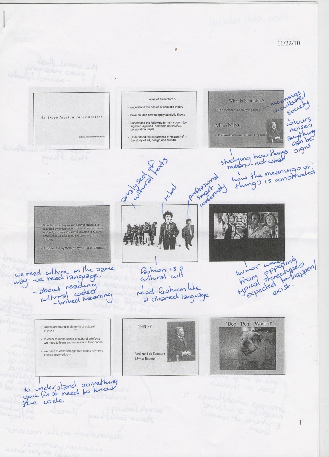
Semiotics is the science of studying signs and their meanings.

A Code is made up of symbols and signs, and are found in everything around us: all forms of cultural practice, and in order for them to make sense we need to learn and understand them. They rely on a shared knowledge. If you have a code that is personal to you and a group of your friends, someone from a different part of the country or the world probably wouldn't have a clue what your on about.

Codes are made up of Signifier and Signified.

  • Signifier - sound image (words that gives meaning - sound/photo)
  • Signified - mental concept (what something actually is/what we think about it)
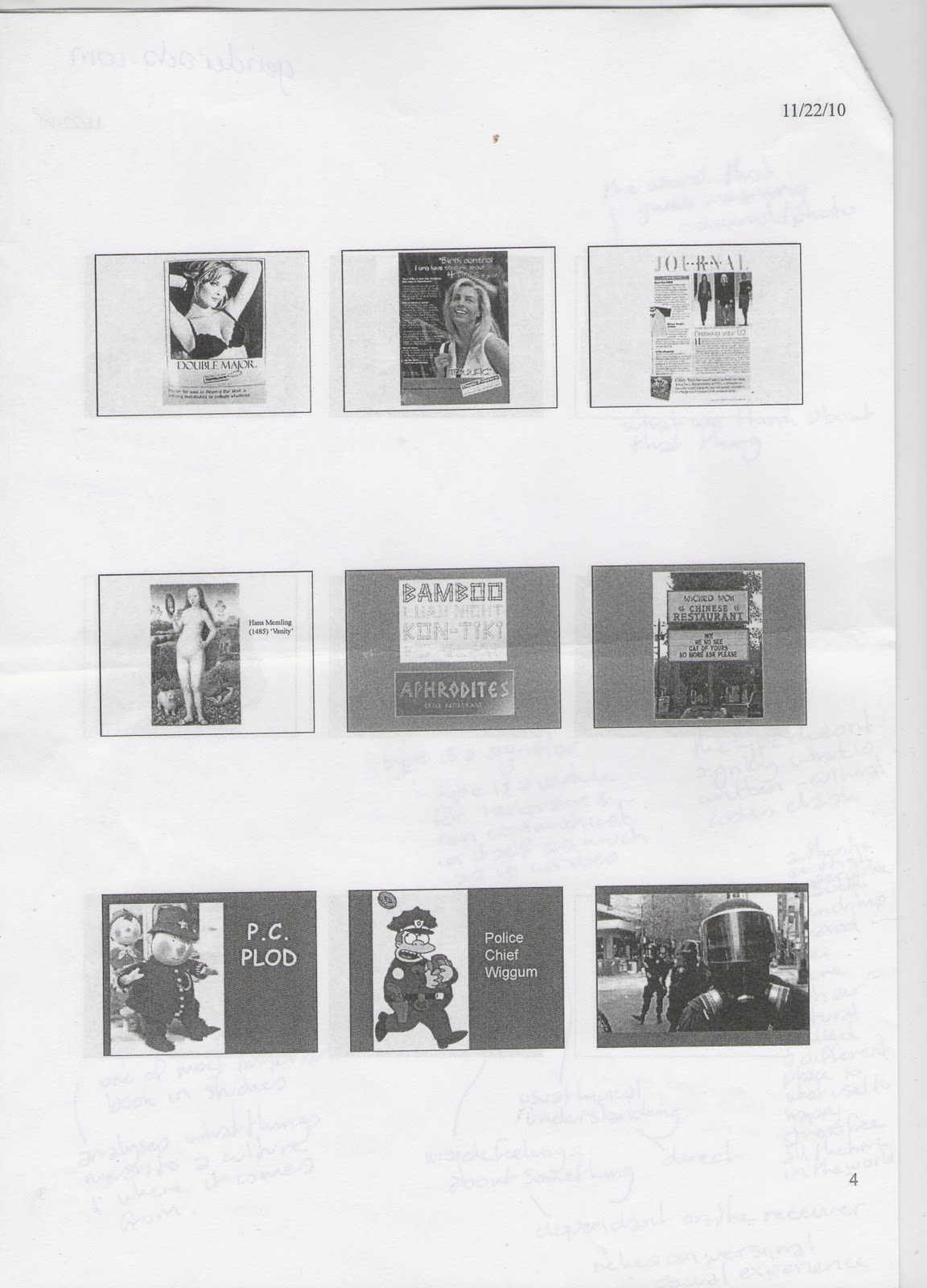
Type is a signifier; it is a vechile for language and can communicate in itself as much as it writes. If it doesn't signify what is written the codes clash.

Denotation - the basic understanding. Usually typical understandings, direct.
Connotation - associational meanings. Inside feelings, dependant on the receiver. Relies on personal social experience.
Myth - comes into play eithin the realm on connotation.

"The Myths which suffuse our lives are insidious precisely because they appear so natural." - Barthes, R.


Task
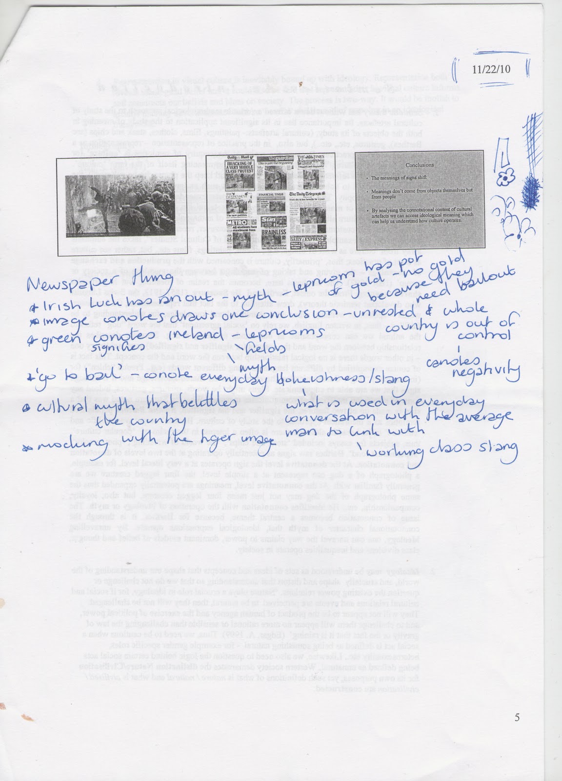
In a group, we were to select an article from a newspaper and find all of the things we have discussed in the seminar using the right terminology.

<image of newspaper article - still to come>

  • Irish luck has ran out - myth - leprechaun has pot of gold but there's no gold because they need bail out.
  • Image connotes draws one conclusion - unrested and whole country out of control - connotes negativity.
  • Green connotes/signifies Ireland - leprechauns/fields/myth.
  • 'Go To Bail' - connotes everyday blokishness/slang - what is used in every day conversation with the average man to link with - working class slang.
  • Cultural myth that belittles country.
  • Mocking with the tiger image.

Semiotics Seminar Notes


Wednesday, 24 November 2010

Lecture 4 - Advertising and New Media

Here are the notes I made on the Advertising and New Media lecture on 24/11/2010.

Objectives are:
   - key points in history of advertising
   - understand context in which advertising emerged
   - understand some aspects of advertising strategy
   - speculate the implications of New Media on creative and the role of the creative.


What is New Media?
Sutherland, 2009 quote.
"...media that work not through persuasion or impressions but through engagement and involvement. If we stick with the old [Mass Media] model, we squander all the possibilities of the new media ecosystem"


    - president of the IPA
    - executive creative director of Ogilvy UK


What is old media?
    - began late 19th Century.

Radio

Robin Wight
   - founder of WCRS
   - future's bright, future's orange
   - 118 118

William Hesketh Lever
   - Lever Bros

Bill Bernbach
   - first to combine copywriters and art directors

In the beginning.. There was soap.
   - sunlight exhibition, Liverpool

Lever Bros, soap
   - today, Unilever, 900 brands
        - Ben and jerks
        - bertoli
        - birds eye
        - persil
        - sunsilk

W.H. Lever 1851
   - same year as Great Exhibition oh 1851

By 1860's
   - changed
        - worked out how to print on packaging
        - mechanically fold and build boxes
        - this brought kelloggs, cols

Lever was the first to package the first bar of soap
   - added value
   - new class

Mid to late 19th century.
   - boom in printed ads
   - press indispensable for ads
   - newspapers
   - posters
        - colour
        - printing press
        - 1890's onwards
        - this technology allowed art to be reproduced

Lever bought art with intentions of using in his advertising
   - he bought 'the new frock' by William Powell Frith
   - 'the wedding morning' by John Henry Frederich (1892)
   - changed some objects in the piece
   - clock and cup - changed to soap

Brand loyalty.

19th century
   - colourful, innovative advertising was crucial to Lever's success

Medicine, chocolate and soap were big on advertisements at this time.
   - soap was the first to become international campaign
        - didn't want it, needed it.

Promotion boom - interactive?
   - influential schemes
   - royal endorsement from 1892 Queen Vic
   - 1903 they began wrapper scheme offering soap in return.

Capture the children.

Investing in advertising
   - Lever spent £2million first 2 decades of making soap
   - purchased Philadelphia soap firm

Art Direction
Gross suggested plantol should depict tropical climates and express the care that is exercised in refining oils
   - a vision to disguise the forced slavery?

Lever - executive creative director
   - always researching new things
   - where to advertise?
   - send ad examples across the country
   - amassed and was among innovators of advertising expertise
   - advocated truth in advertising is an asset; falsehood in advertising is a liability

Lever - salvation
   - many of his early ads emphasised that sunlight soap would save women from drudgery.

Sunlight soap and how to use it, spoke to working class housewives
   - improves lives
   - easier
   - save sex life
   - save marriage
   - quality time for romance
   - quick

The employed international agencies
   - particularly for American market
   - britishness suited all

The British imperial mission
   - to civilise
   - no commodity aided more than soap

The Lynx Effect. Quote,
"The message was clear, if one wished to gain or retain a partner, a job, a reputation and self esteem, one needed to attend to personal hygiene...sales skyrocketed"

New media model
   - shift in last decade from mass media to my media
        - more personalised

Viral advertising
   - one distinction between new and old media
        - voluntary viewings (video viewings online)
        - forced viewings (tv or print)

Definition of viral.
"unpaid peer-to-peer communication of content originating from an identified sponsor using the Internet to persuade or influence an audience to pass along the content to others"

New communicational model
   - engaging with an audience
        - via comp

Trevor Beattie: ideas
   - forget next big idea and come up with lots of small ideas
   - Internet is last big idea
        - allows lots of small ideas to circulate
   - digital media > convergence of media opens ip opportunities for realcreatives

Viewer generated content
Coke and Mentos
   - these were worth £10million to Mentos


Old Spice

Tuesday, 23 November 2010

5 Examples of Modernist Graphic Design

Here is my 5 examples of Modernist Graphic Design.


Modernism, in all was a revolt against the conservative values of realism, and encompasses the activities and output of those that considered the fact that ‘traditional art’ was becoming outdated, meaning it was a reductive movement. The term is used to describe the cultural expressions of modernity in relation with the experience, and at the time people believed that design and art could change the way people think. It began just after WWI due to people’s optimism and believed that Modernism would lead towards a progressive society with the notion that the idea of change is better: meaning the goal of it was to create a better life. The main function to this was the belief that the form of an object should be dictated by its function – “form follows function”, shifting away from unnecessary decorations disguising the actual materials in which something was made from. The design initiatives had to allow for the mass production of goods, meaning the more simple forms were preferred.


Filippo Tommaso Marinetti / 1914 / Parole In Liberta  / URL


Adolphe Muron Cassandre / 1935 / Normandie / URL

This example by Cassandre is a great example of the modernist way of 'form follows function', with the whole thing being kept very simple and communicated its message clearly.


Jan Tschichold / 1927 / Die Frau ohne Namen / URL

The composition of this poster is stripped back to the simple lines and shape, with an informed layout within them of the type and images. There is little actual information used so it is straight to the point. The poster as a whole looks quite abstract.


Lyubov Popova / 1922 / Val's Pamiati Skriabina / URL


Joost Schmidt / 1923 / Bauhaus Exhibition / URL

Wednesday, 17 November 2010

Lecture 3 - The Document

Here are my notes from The Document lecture we had on 17/11/2010.

"I have been a witness, and these pictures are my testimony. The events I have recorded should not be forgotten and must not be repeated."

Aims:
   - introduce documentary photography and conflict photography
   - introduce the work of Mass Observation, Magnum and the FSA Photographers
   - explore questions of objectivity and subjectivity inherent in documentary practice
   - interrogate the authority of the photographic image


Documentary photography has dominated the 20th Century.

Joseph Nicephore Niepce - View from a window at La Gras (1826)

Genre is difficult to define.
   - wide variety of styles and topics.

Idea/term document signifies evidence of something not to be questioned.

Use of camera not only to record but to document and radicalise situations
   - camera with a conscience.
   - not just there to record but also there to expose situations
   - contact between audience and photography

The role is not to be just an invisible eye,
   - involve themselves
   - taking a stance
   - aligning themselves.

Old photography became popular of showing the other how others live.

William Edward Kilburn - The Great Chartist meeting at the common (1848)
   - photographer not involved
        - higher
        - not seen
        - removed
   - authenticity, historical fact?

How can a photographer not influence events in any way?
   - factual records of events
   - only records of history

People want to capture the world and war becomes key focus.


The Decisive Movement

Henri Cartier-Bresson,
   - depiction of everyday
   - also composed
   - have photos in head before took it


"photography achieves its highest distinction - reflecting the universality of the human condition in a never-to-be-retrieved fraction of a second"

   - more artistic
   - composed


How much of documentary photography concerns itself with aesthetics?

Jacob Riis
   - middle class social campaigner
        - squoller and poverty
   - book - how the other half live

Sensationalising recording.
   - morbid fascination for others
        - allowing the rich to spy on the poor.


Jacob Riis - Bandits Roost (1888)
   - not invisible eye
   - not neutral
   - posing for it
   - not depiction of real life but how they want it to appear
   - Riis fantasy?

Jacob Riis - A growler gang in session (robbing a lush) (1887)
   - posing
   - all in same clothes
   - acting
   - artificial representation


Lewis Hine - Russian Steel Workers (1908)
   - subtle
   - more empathy
   - more humanity
   - more neutrality - awkward
   - not stereotyped people


F.S.A Photographers (1935-44)
   - 2 ways of appoaching communication
   - director Roy Stryker
   - Depression- 11million unemployed
   - mass migration of farm labourers 'oakies'
   - the photograph as both emotive photojournalism and emotive lobbying tool

F.S.A = Farm Security Administration

   - photographers given shooting scripts
        - what to take
        - how to take it
   - has a total agenda

Margaret Bourke-White - Sharecroppers Home (1937)
   - documents with agenda
        - not neutral

Russell Lee - Interior of a black farmers house (1939)
   - same as the previous example but a different way of representing

Dorothea Lange - Migrant Mother (1936)
   - became poster for the great depression
   - try draw parallels 
   - arranging the people like actors until they get what they like

Robert Frank
   - exposing America

John Lamprey - Front and profile views of a malayan male (1868)
   - comparing other to self
   - used to prove judging people to characteristics
        - justify scientifically black inferior to the white

Photography is power.

Mass Observation 1937-60
   - science project
   - Tom Harrison
   - Charles Madge
   - Humphrey Jennings
   - Humphrey Spender

Neutral democratic response to the woking class.
   - more accurate document of the world.


War/Conflict Photography.

Robert Capa - Normandy, France (1945)
   - becomes it's own
   - provide horrifying examples of living
   - he was there when everything was happening so unfair to ask if they are 'real' - but they have


Magnum Group
   - international group of documentary photography
   - founded 1947 by Capa and Cartier-Bresson
   - ethos of documenting the world and its social problems


Robert Haeberle - People about to be shot (1969)
   - intercepted the moment where people about to be shot
   - last moment of peoples lives
   - inhumanity
   - should he have intervened and tried to stop it happening?

Documentary Photography
   - desire to show horror of the world to try and make a difference.

Key Features
   - offer humanitarian perspective
   - potray social and political situations
   - porport to be objective to facts of situations
   - people tend to form the subject matter